
SEOX: Rebranding einer Schweizer SEO-Agentur
Rebranding einer Schweizer SEO-Agentur. Logo, Farbwelt, Website und Printmedien in vier bis sechs Wochen.
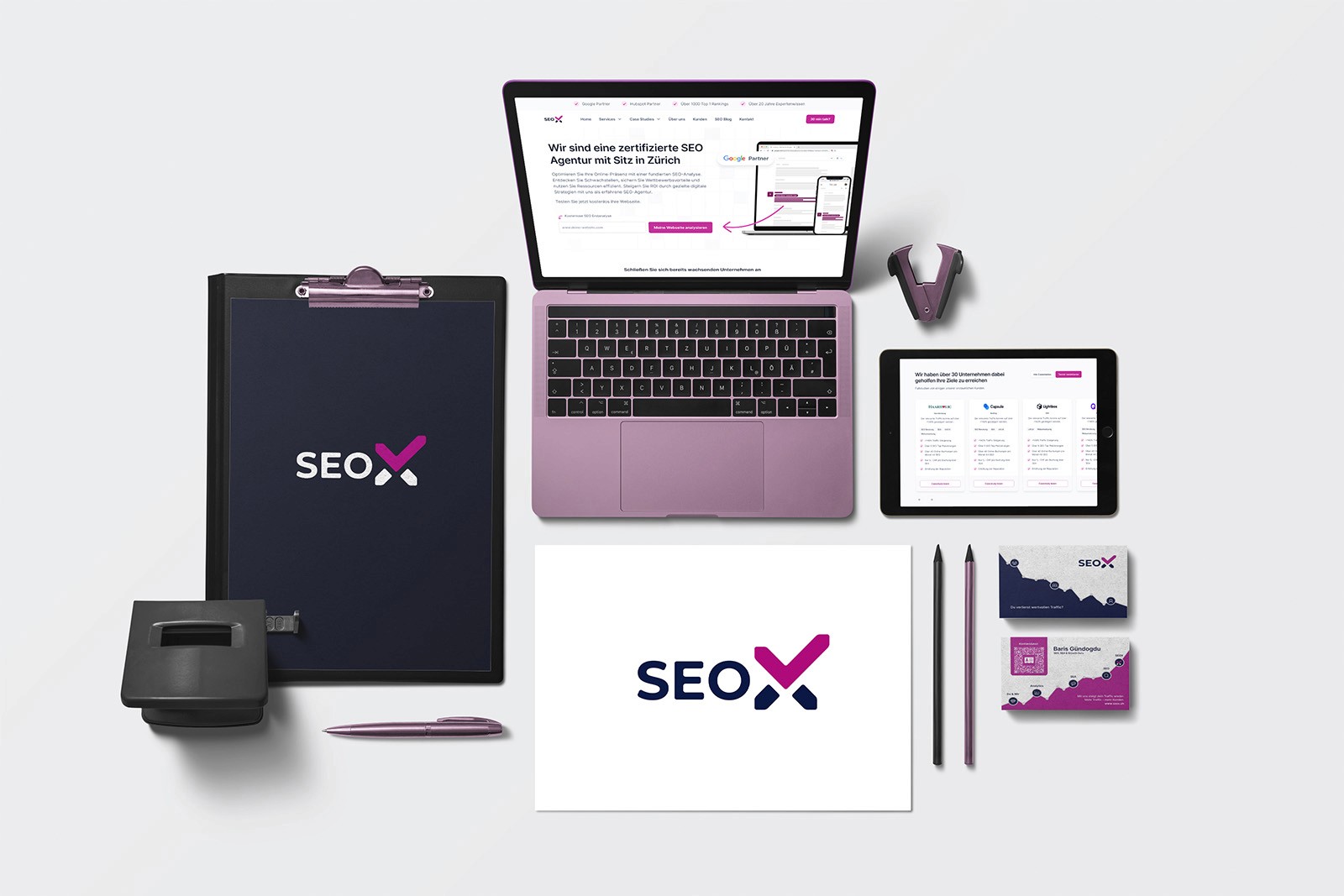
The result in one sentence
Komplettes Rebranding in 4 bis 6 Wochen. Logo, Farbwelt, Website, Print. Mit Folgeaufträgen.
UX/UI Designer, Brand Designer, Projektkoordination
Inhaber · Marketing Manager
SEOX wollte seinen Markenauftritt erneuern.
Bestehende Agentur
Der Auftritt sollte die Leistungen von SEOX zeitgemäss zeigen.
Klares Kundenziel
Ein moderner Auftritt mit definierter Farbwelt auf Magenta-Basis.
Voller Umfang
Logo, Farbkonzept, Website-Redesign und Printmedien in einem Zug.
Ein Rebranding im Zeitfenster einer Kampagne, mit Jahresenddeadline.
Wenige Wochen bis zum Stichtag
Projektstart kurz vor dem gesetzten Fertigstellungstermin.
Laufende Kundenkommunikation betroffen
Der Wechsel musste sitzen. Ein zweiter Anlauf war nicht vorgesehen.
Persönliche Nähe zum Auftraggeber
Höhere Erwartung, kürzere Wege. Beides gleichzeitig.
Klare Priorisierung, schnelle Iterationen, tägliche Abstimmung.
Markenkern zuerst
Logo und Farbkonzept als Fundament, alles Weitere leitet sich daraus ab.
Website im neuen Look
Komplette Neugestaltung entlang der neuen Markenidentität.
Kurze Feedbackzyklen
Enge Abstimmung statt großer Präsentationsrunden. Fertigstellung in vier bis sechs Wochen.
Komplettes Rebranding in 4 bis 6 Wochen
Logo, Farbwelt, Website und Visitenkarten pünktlich geliefert.
Wiedererkennbare Markenwelt
Magenta-basiertes Farbkonzept über alle Medien hinweg konsistent.
Folgeaufträge
Die Zusammenarbeit ging nach Projektabschluss weiter.
What I take away from it
Marke über Medien hinweg gestalten
Ein gemeinsames Farb- und Gestaltungssystem verband Website und Printmedien.

Swisscom Kids Mobile: Ein neues Angebot für Kinder
Ein neues Mobile-Angebot für Kinder. Vom Konzept bis zur Bestellstrecke.

Swisscom Prepaid für Tourist:innen: Landingpage von null aufgebaut
Von null auf live: neue Prepaid-Landingpage mit Traffic-Aufbau und ersten Abschlüssen.

Redesign der WLAN-Box-Produktseite für Swisscom
Conversion rate increased by 600% after the redesign.