
UPC: Rabattbanner mit regionaler Auswertung
65 Prozent niedrigere Conversion in der französischen Version.
The result in one sentence
65 Prozent niedrigere Conversion in der französischen Version.
Conversion Optimizer, UX Strategist, Test Manager, Implementierung (hands-on)
Content Manager Publisher · UX Ui Designer
Ein exklusiver Vorteil wurde kommuniziert, aber nicht erklärt.
Partnernetzwerk-Aktion
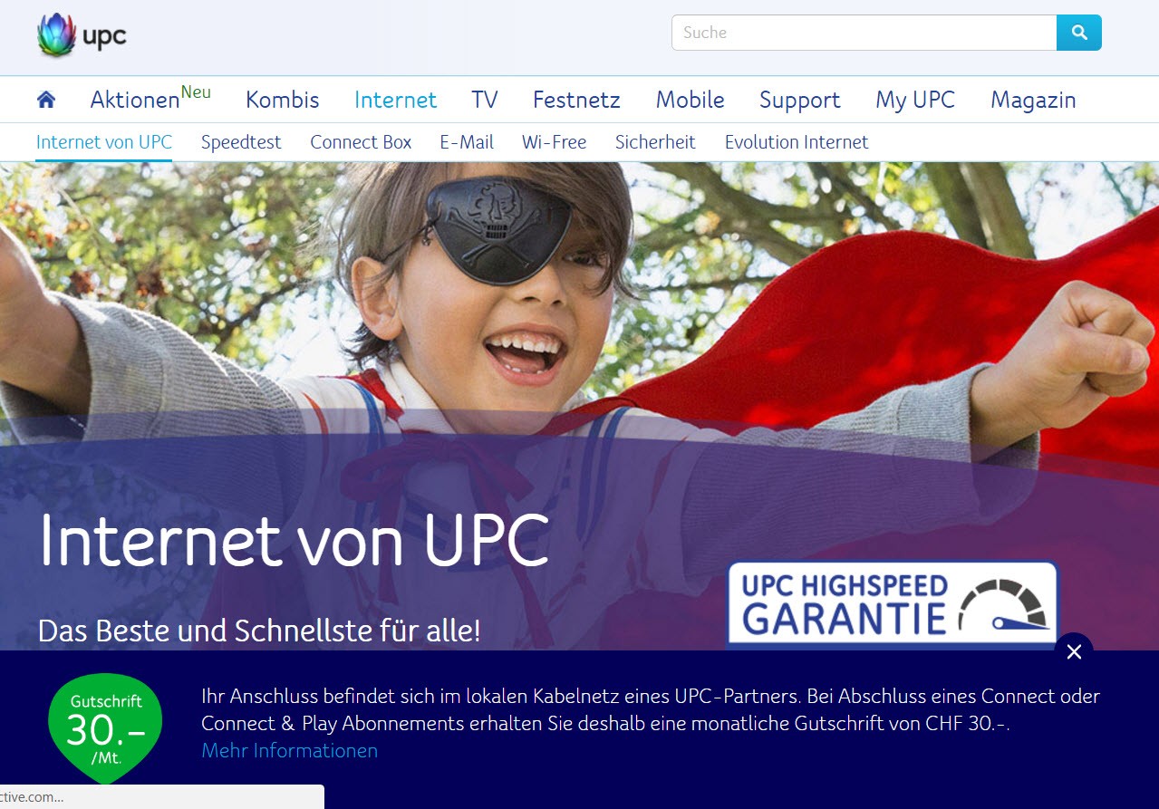
Ein exklusives Angebot über CHF 30 sollte sichtbar gemacht werden.
Ansatz
Ein Sticky-Banner mit Verlinkung auf eine generische Landingpage.
Schwachstelle
Weder Banner noch Zielseite erklärten, für wen der Vorteil gilt.
Wie informiert man, ohne zu verunsichern?
Hypothese
Ein auffälliger Banner erhöht Awareness und damit Abschlüsse.
Risiko
Passen Botschaft und Kontext nicht zusammen, entsteht Misstrauen statt Anreiz.
Vorwissen aus Usability-Tests
Uninformierte Nutzer:innen greifen zur Hotline statt zum Abschluss.
A/B-Test mit sprachregionaler Auswertung.
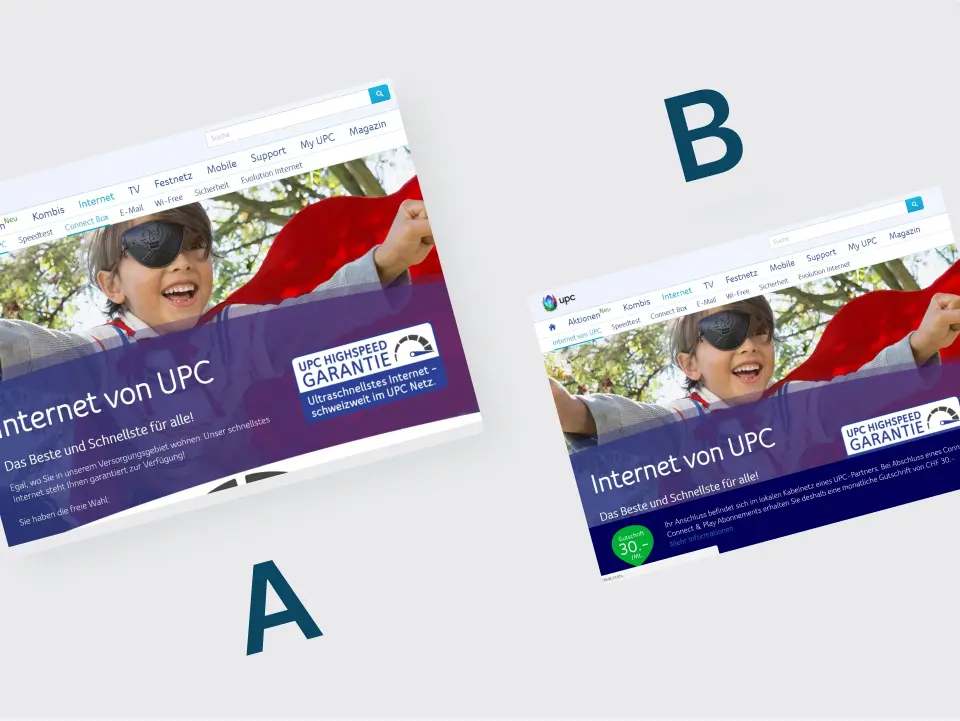
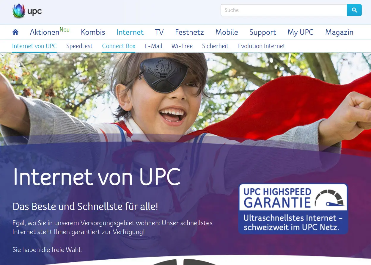
Version A
Kein Banner. Kontrollversion.
Version B
Sticky-Banner mit pauschalem CHF-30-Vorteil, verlinkt auf eine generische Seite.
Auswertung
DE- und FR-Region getrennt gemessen, genau das machte den Effekt sichtbar.
Conversion (FR)
−65 %
Sprachregionen getrennt ausgewertet
Die Auswertung unterschied zwischen der deutschen und der französischen Variante.
Rollout gestoppt
Die getestete Variante wurde nicht breit ausgerollt.
What I take away from it
Sprachregionen getrennt betrachten
Die getrennte Auswertung war für die Entscheidung über den Rollout wesentlich.
Botschaft und Zielseite abstimmen
Mögliche Erklärung: Die Bedingungen des Rabatts waren nicht klar genug.
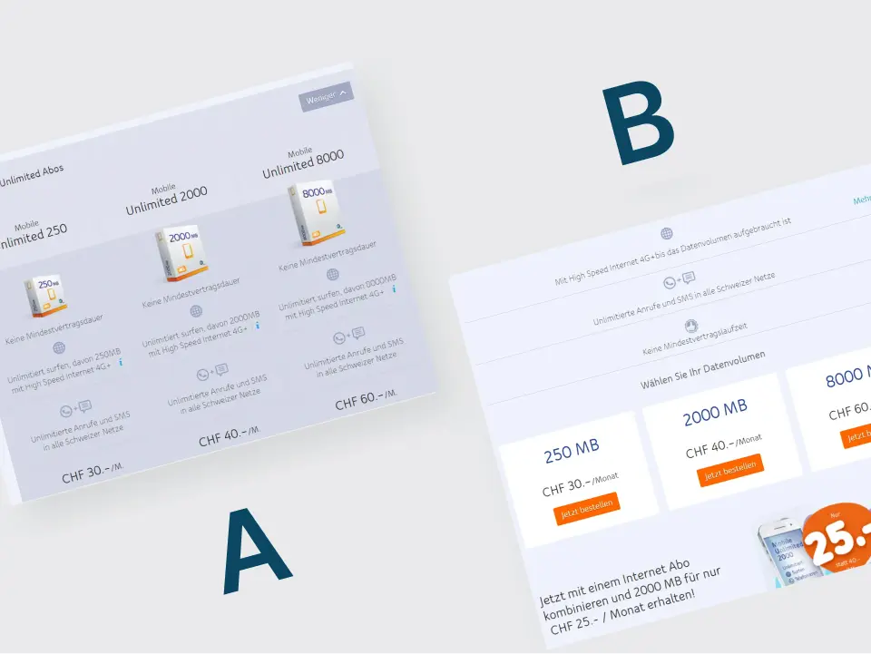
UPC: Weniger Tarifinformation im Test
35,1 Prozent niedrigere Conversion bei der vereinfachten Tarifseite.
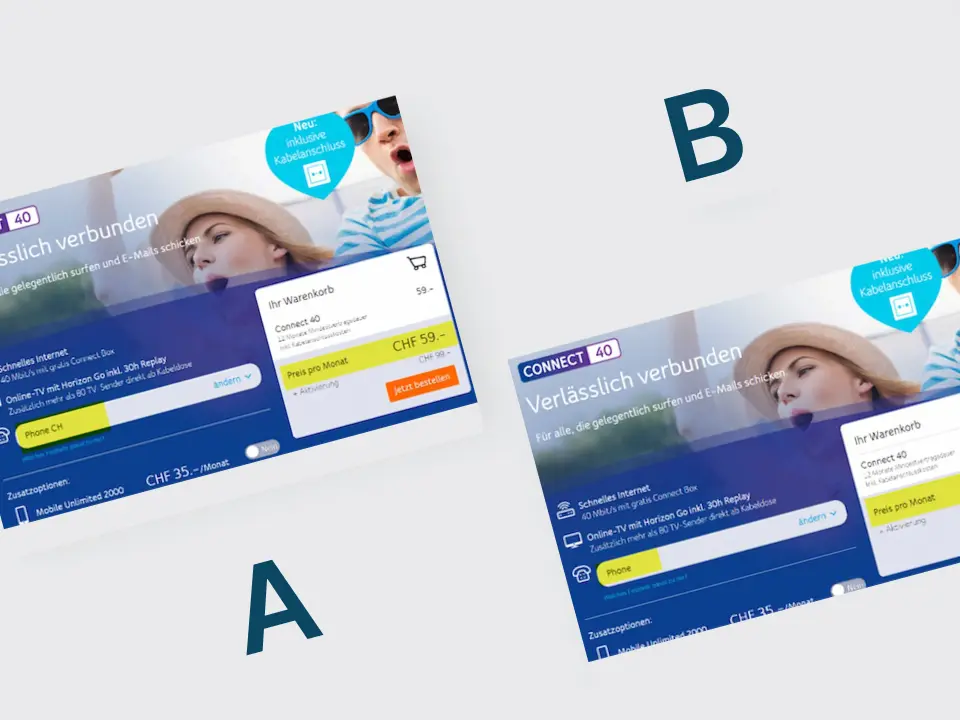
UPC: Günstigere Vorauswahl im Tarif getestet
Die günstigere Vorauswahl zeigte im Test eine niedrigere Conversion. Das Ergebnis war statistisch nicht eindeutig.
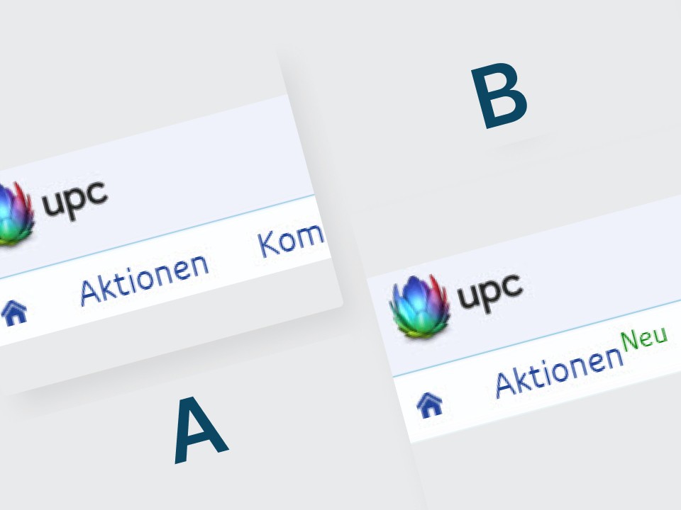
UPC: Ein Neu-Label erhöht die Klickrate um 86 Prozent
Ein Neu-Label erhöhte die Klickrate um 86 Prozent.