
UPC: Zwei mobile Einstiege zur Produktauswahl
Zwei mobile Einstiege erleichterten den Zugang zur Produktauswahl.
The result in one sentence
+48,1 % Internet+TV Sales und +20,9 % Conversion durch zwei mobile Teaser.
Conversion Optimizer, UX Strategist, Test Manager, Implementierung (hands-on)
UX Ui Designer · Content Manager Publisher
Auf kleinen Screens war das Portfolio schwer zu durchdringen, und die Hilfen dazu waren praktisch unsichtbar.
Mobile Funnel ohne Führung
Nutzer:innen fanden sich im Angebot schwer zurecht.
Startseite ohne Hilfestellung
Kein direkter Einstieg in die Produktauswahl.
Verschenkte Assets
„Product Finder“ und „Combine your own“ existierten, waren aber kaum verlinkt.
Mehr Führung auf kleinem Screen bedeutet auch mehr Ablenkung, die Balance war die eigentliche Frage.
Hypothese
Zwei Teaser zu „Produktfinder“ und „Kombiniere dein eigenes Paket“ erhöhen Interaktion und Conversion.
Ziel
Orientierung plus Autonomiegefühl durch eigene Konfiguration.
Offene Frage
Kippt das auf Mobile in Ablenkung um?
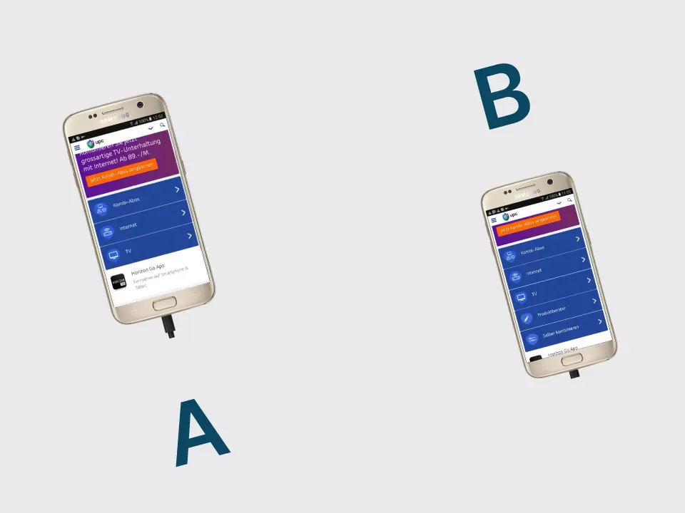
A/B-Test mit zwei gezielten Teasern auf Start- und Übersichtsseiten, nur mobil.
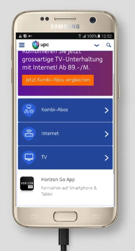
Version A
Kein Teaser, klassischer Funnel.
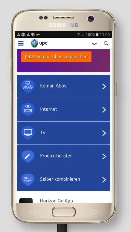
Version B
Zwei Teaser mit direktem Weg zu „Produktfinder“ und „Combine your own“.
Annahme dahinter
„Combine your own“ verbindet Klarheit mit Kontrolle, ein starkes Muster für Mobile.
Gesamt-Conversions
+20,9 %
Internet+TV Sales
+48,1 %
Traffic
+42,6 % auf „Combine your own“, +119,8 % auf den „Product Finder“
Folgeentscheidung
„Combine your own“ wurde als primärer Conversion-Pfad priorisiert.
What I take away from it
Vorhandene Hilfen zugänglich machen
Die zwei Teaser erhöhten im Test die Nutzung der Produktauswahl und die Conversion.
Pfade getrennt auswerten
Die Ergebnisse halfen uns, den Einstieg über die eigene Konfiguration zu priorisieren.
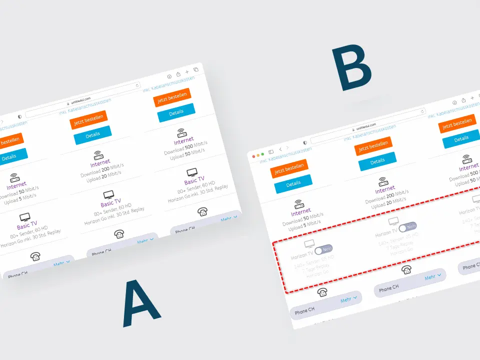
+32 % Neukunden-Bestellungen: Upsell als Option statt als Bundle
+32,3 % Neukunden-Bestellungen und +17,1 % Umsatz durch optionales TV-Upsell.
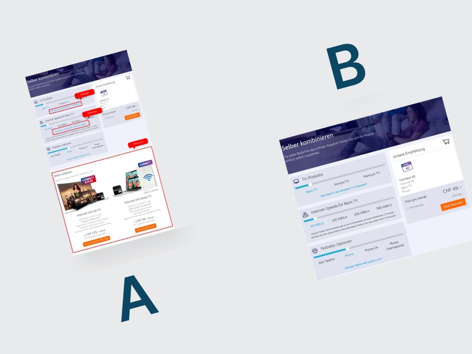
+15,1 % Conversion: Weniger Ablenkung in der Bundle-Konfiguration
+15,1 % Conversion durch das Entfernen irrelevanter Links und Teaser.
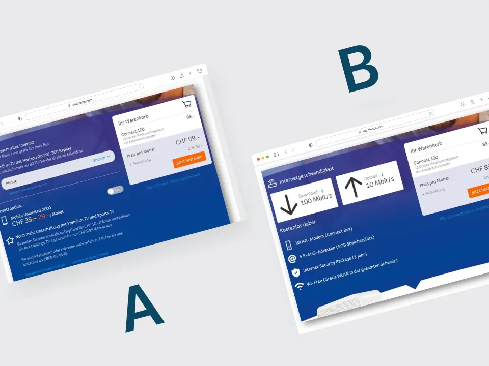
+23 % Sales: Ein klar positioniertes „Internet Only“-Angebot
+23 % C&P Sales durch ein klar positioniertes Internet-Only-Angebot.