
+23 % Sales: Ein klar positioniertes „Internet Only“-Angebot
Ein klar positioniertes Internet-Only-Angebot erzielte im Test 23 Prozent mehr Internet+TV-Verkäufe.
The result in one sentence
+23 % C&P Sales durch ein klar positioniertes Internet-Only-Angebot.
Conversion Optimizer, UX Strategist, Test Manager, Implementierung (hands-on)
Content Manager Publisher · UX Ui Designer
Nutzer:innen suchten reines Internet, und fanden nur Dreierpakete.
Unklare Produktstruktur
Alle Abos wurden als 3P-Bundles aus Internet, TV und Telefon dargestellt.
Belegter Bedarf
Umfragen zeigten, dass viele gezielt ein Internet-Only-Angebot suchten.
Vertrauensproblem
Die Darstellung erzeugte das Gefühl, für nicht benötigte Leistungen mitzuzahlen.
Entscheidungsfrust senken, ohne Angebotsvielfalt zu verlieren.
Ziel
Kund:innen mit klarem Internetbedarf abholen, ohne andere Optionen zu verstecken.
Hypothese
Connect als eigenständiges 1P-Angebot zu zeigen erhöht das Gefühl, verstanden zu werden.
Risiko
Zu viel Vereinfachung könnte Kombi-Interessierte verlieren.
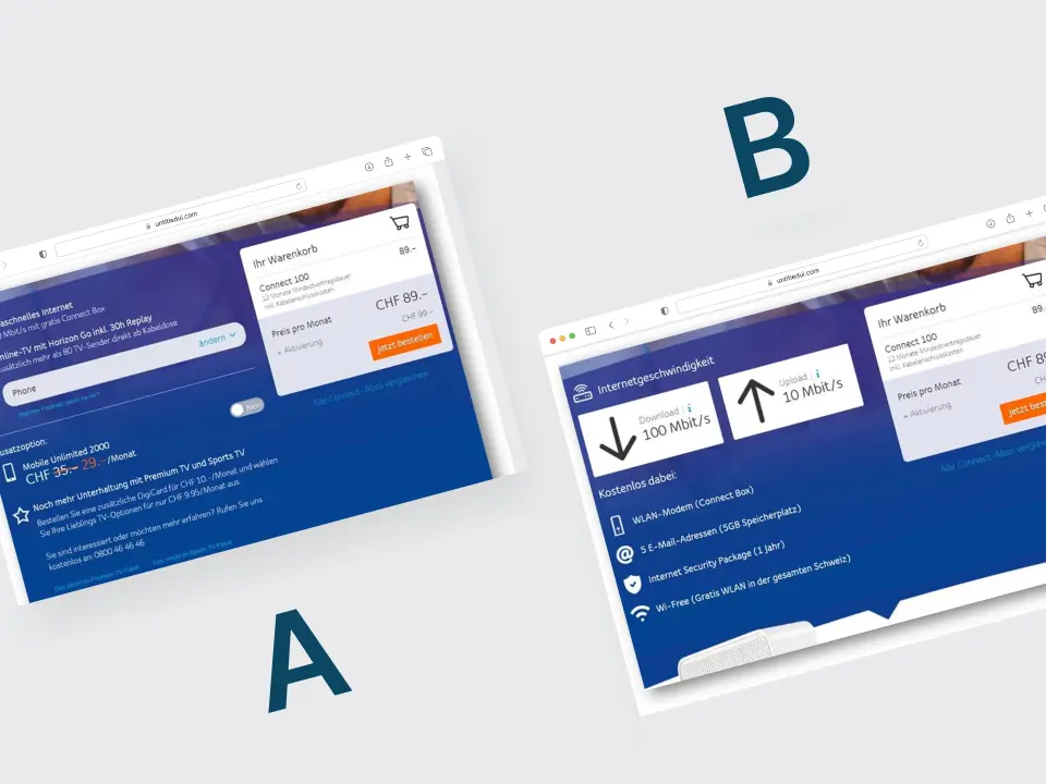
A/B-Test mit neu strukturiertem Portfolio und klarer 1P-Kommunikation.
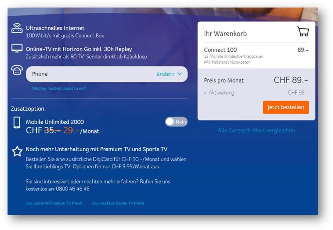
Version A
Alle Angebote gleichwertig als 3P-Pakete.
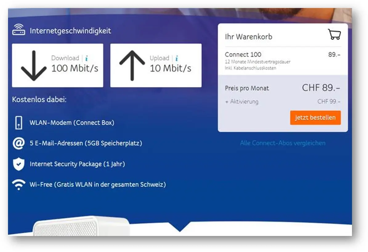
Version B
Connect eindeutig als „Internet Only“, ohne TV und Telefon im Sichtbereich.
Umsetzung
Konzept, Setup, Targeting und Auswertung vollständig von mir.
C&P (Internet+TV) Sales
+23 % bei 95 % Signifikanz
Conversion Rate gesamt
leicht positiv (+0,04 %)
Mögliche Erklärung
Die getrennte Darstellung könnte die Orientierung im Angebot erleichtert haben.
What I take away from it
Angebotsstruktur testen
Die neue Darstellung erzielte im Test mehr Internet+TV-Verkäufe.
Bedarf als Ausgangspunkt
Die Recherche zum Internet-Only-Bedarf bestimmte die getestete Struktur.
UPC: Rabattbanner mit regionaler Auswertung
65 Prozent niedrigere Conversion in der französischen Version.
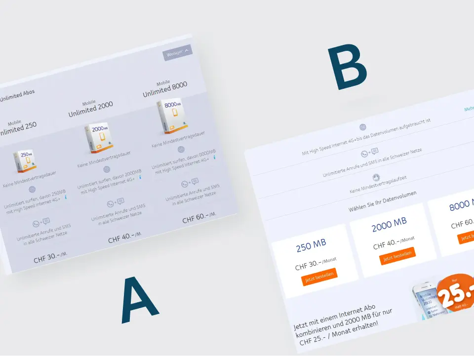
UPC: Weniger Tarifinformation im Test
35,1 Prozent niedrigere Conversion bei der vereinfachten Tarifseite.
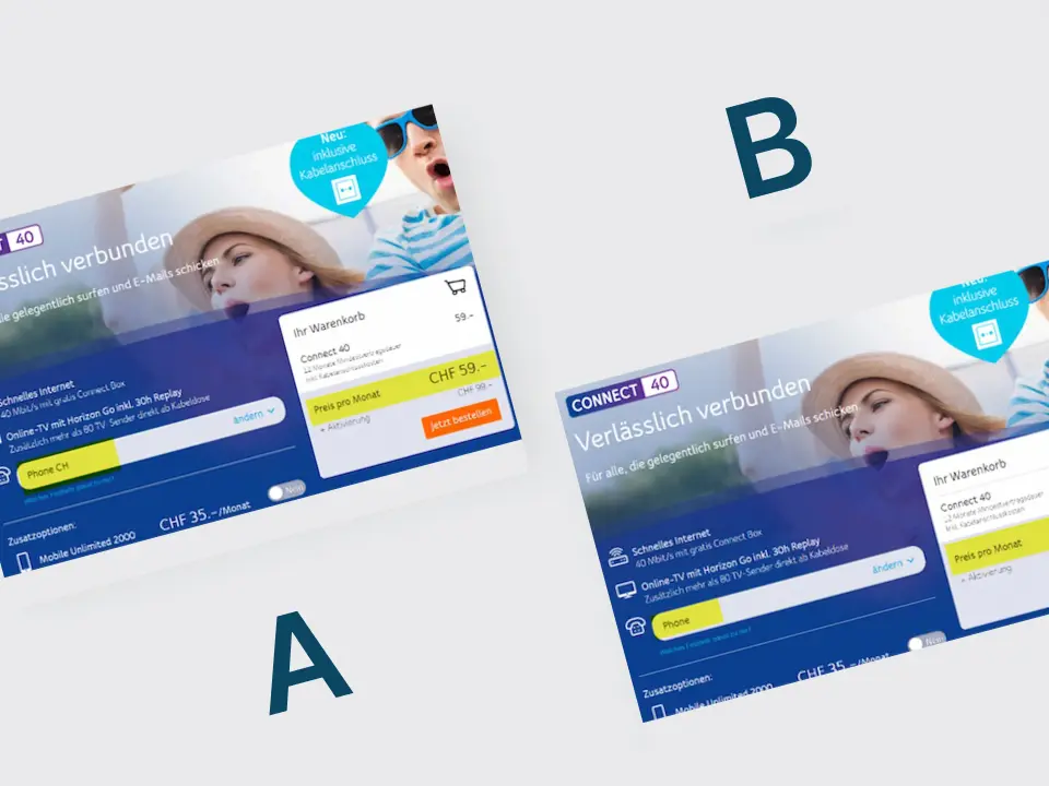
UPC: Günstigere Vorauswahl im Tarif getestet
Die günstigere Vorauswahl zeigte im Test eine niedrigere Conversion. Das Ergebnis war statistisch nicht eindeutig.