
+15,1 % Conversion: Weniger Ablenkung in der Bundle-Konfiguration
Das Entfernen irrelevanter Links und Teaser auf der Konfigurationsseite steigerte die Conversion Rate um 15,1 % bei 95 % Signifikanz.
The result in one sentence
+15,1 % Conversion durch das Entfernen irrelevanter Links und Teaser.
Conversion Optimizer, UX Strategist, Test Manager, Implementierung (hands-on)
UX Ui Designer · Content Manager Publisher
Auf der Seite, auf der Menschen ihr Paket bauen, standen die meisten Auswege.
Erwartungsbruch
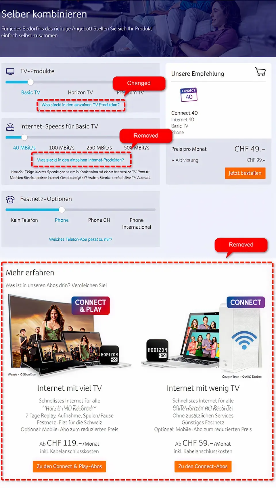
Der TV-Link führte nicht zu TV-Paketinfos, sondern auf eine generische Übersicht.
Zielkonflikt
Zwei Teaser am Seitenende zogen Nutzer:innen aus der Konfiguration heraus.
Wirkung
Reorientierung statt Abschluss.
Wie fokussiert man Menschen, die ohnehin kurz vor dem Abschluss stehen?
Hypothese
Weniger ablenkende Links könnten den Abschluss der Konfiguration erleichtern.
Ziel
Erwartungskonformität herstellen, unnötige Entscheidungen entfernen.
Risiko
Zu starke Reduktion könnte nützliche Informationen mitnehmen.
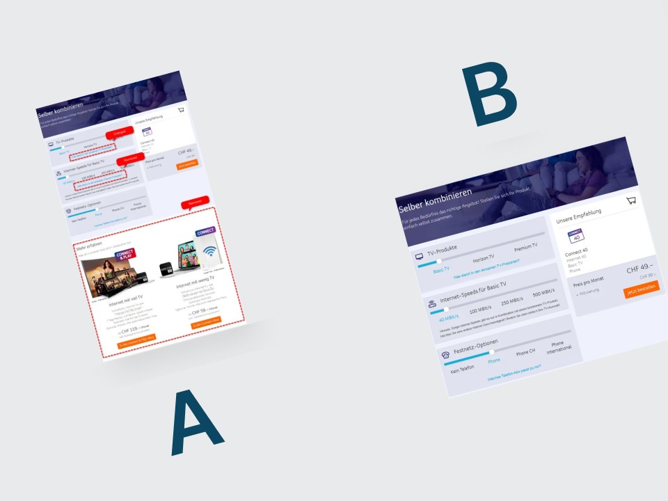
A/B-Test mit bereinigter Konfigurationsseite.
Version A
TV-Link auf Übersichtsseite, Internet-Link vorhanden, zwei Teaser am Seitenende.
Version B
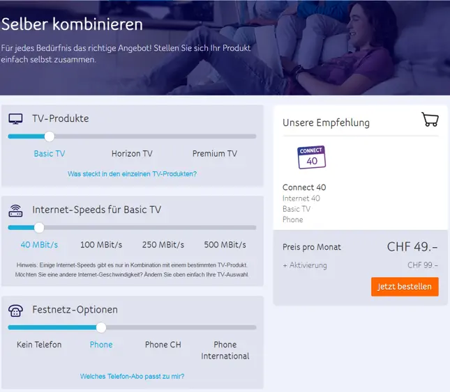
TV-Link direkt auf die Senderliste, Internet-Link und Teaser entfernt.
Grundannahme
Die Bereinigung könnte unnötige Seitenwechsel reduzieren.
Conversion Rate
+15,1 %
Signifikanz
95,1 %
Mögliche Erklärung
Weniger ablenkende Links könnten die Orientierung in der Konfiguration erleichtert haben.
What I take away from it
Konfiguration fokussieren
Die bereinigte Konfiguration erzielte im Test eine höhere Conversion.
Linkziele prüfen
Der TV-Link führte in der Variante direkt zur Senderliste.
+23 % Sales: Ein klar positioniertes „Internet Only“-Angebot
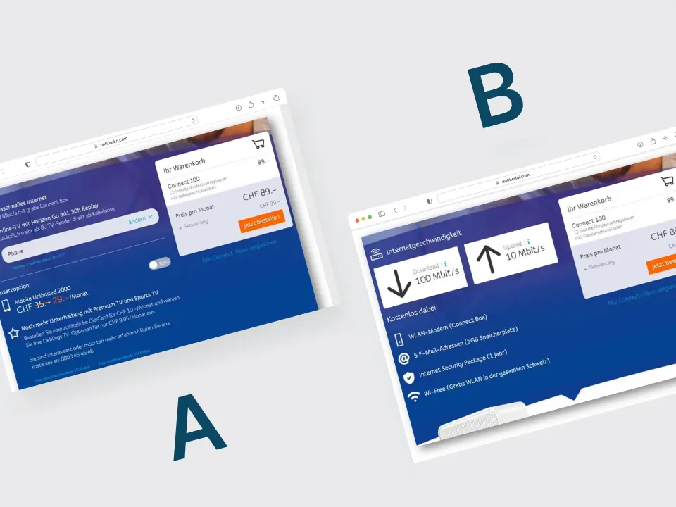
+23 % C&P Sales durch ein klar positioniertes Internet-Only-Angebot.
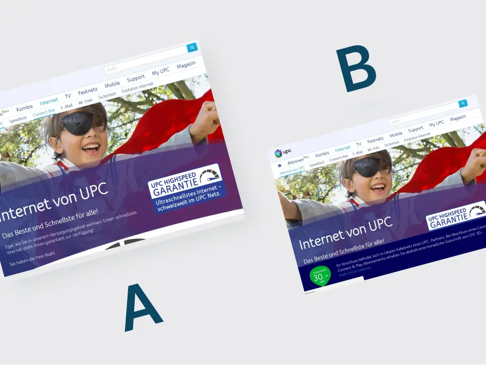
UPC: Rabattbanner mit regionaler Auswertung
65 Prozent niedrigere Conversion in der französischen Version.
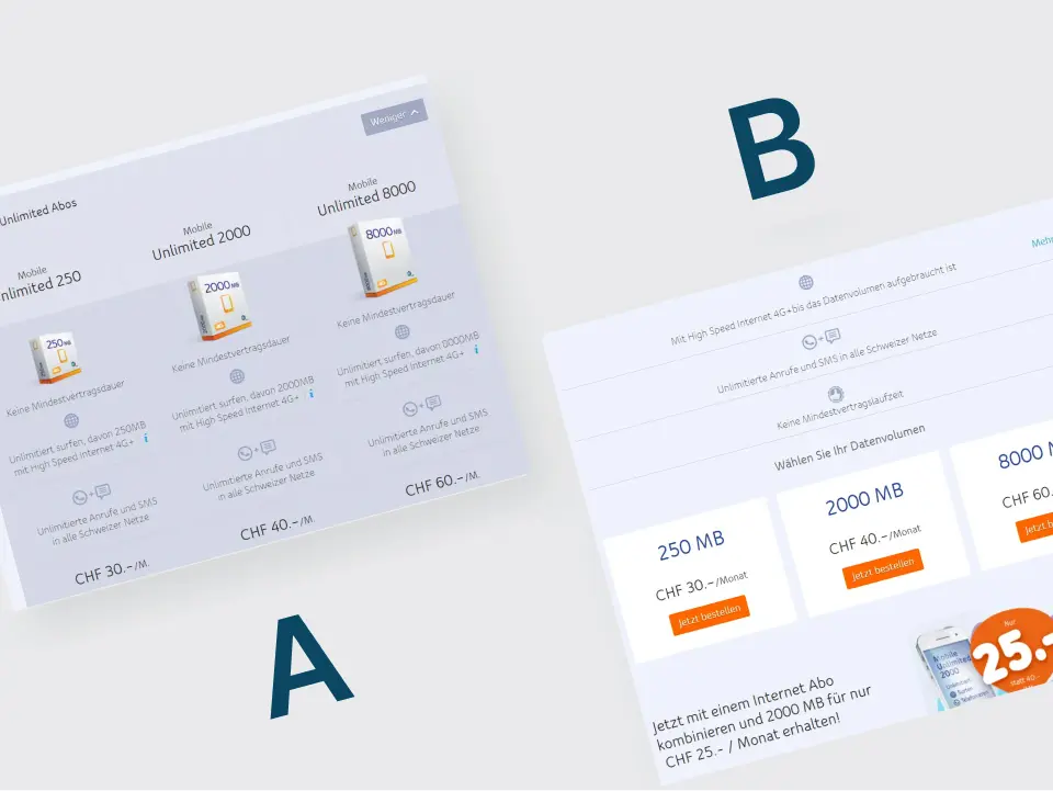
UPC: Weniger Tarifinformation im Test
35,1 Prozent niedrigere Conversion bei der vereinfachten Tarifseite.