
Status tracking in the MyAXA app
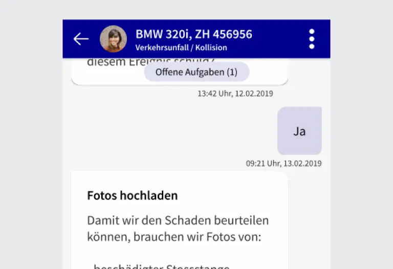
Interaction board for clear claims status, next steps and interaction in MyAXA. Prototype validated in three months, implementation postponed.
The result in one sentence
Status und nächste Schritte im Prototypentest validiert. Die Umsetzung wurde verschoben.
UX Designer, User Researcher, Prototyping Lead
Produkt Manager · Business Analyst
Nach der Schadenmeldung wussten Kund:innen nicht mehr, wer als Nächstes am Zug ist, und riefen an, um es herauszufinden.
Intransparenter Prozess
Ob AXA, Garage oder Kunde den nächsten Schritt macht, war nicht erkennbar.
Supportkosten durch Unsicherheit
Statusanfragen banden Callcenter-Kapazität, teils mehrfach pro Fall.
Keine digitale Nachreichung
Rechnungen und Fotos ließen sich nicht unkompliziert ergänzen.
Die naheliegenden Lösungen fielen im Test durch.
Fragmentierte Kommunikation
Kund:innen mussten sich zwischen AXA, Werkstatt und Beteiligten selbst durchfragen.
Unklare UI-Muster
In frühen Entwürfen war nicht erkennbar, wo neue Informationen erscheinen. Nutzer:innen suchten in die falsche Richtung.
Keine End-to-End-Logik
Statusverfolgung, Nachreichung und Rückfrage waren nie zusammen gedacht.
Testergebnisse gegen den Entwurf
Die ersten Usability-Tests zeigten, dass bestehende Ansätze das Problem verschärften.
Ich übernahm das laufende Projekt und entwickelte die Lösung über mehrere Testschleifen weiter.
Qualitativer Research zuerst
Interviews mit betroffenen Kund:innen entlang der realen Schadenreise.
Bestehendes Konzept auditiert
Scroll-Unklarheit, fehlende Statuslogik und fehlende Interaktion als Kernprobleme identifiziert.
Mehrere Prototyping-Schleifen
Verschiedene UI-Ansätze getestet, das Conversational UI setzte sich im Nutzerurteil durch.
Vertrautes Muster genutzt
Chat-Oberfläche mit Status, Upload und Rückfragemöglichkeit.
Status und nächste Schritte validiert
Orientierung und Interaktion im Prototypentest geprüft.
Prototyp in drei Monaten
Mehrere Varianten entwickelt und mit Nutzenden getestet.
Umsetzung verschoben
Das Projekt ging nach der Validierung nicht in die Umsetzung.
What I take away from it
Tests veränderten die Richtung
Das Conversational UI entstand aus dem Nutzerfeedback.
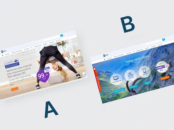
+23,1 % Umsatz: Regionale A-Spot-Personalisierung mit Produkt-Bubbles
+20,5 % Conversion und +23,1 % Umsatz durch regionale Personalisierung . 95 % Signifikanz.
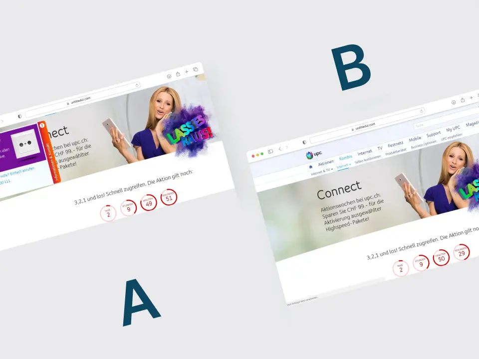
UPC: Telefonberatung im Online-Kaufprozess
Telefonberatung im Online-Kaufprozess getestet.
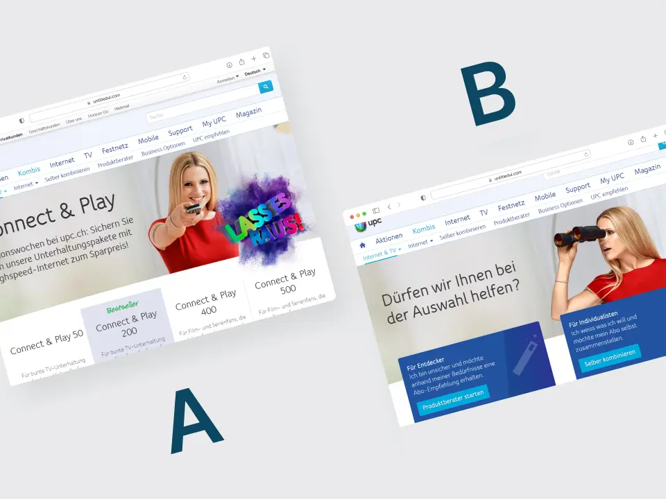
UPC: Nutzerführung ohne Mobile-Angebot im Test
Die getestete Nutzerführung senkte die Bestellungen um 25 Prozent.