
+23,1 % Umsatz: Regionale A-Spot-Personalisierung mit Produkt-Bubbles
Ein regional personalisierter A-Spot mit Produkt-Bubbles steigerte die Conversion Rate um 20,5 % und den Umsatz um 23,1 %, bei 95 % Signifikanz.
The result in one sentence
+20,5 % Conversion und +23,1 % Umsatz durch regionale Personalisierung . 95 % Signifikanz.
Conversion Optimizer, UX Designer, Test Manager, Implementierung (hands-on)
UX Ui Designer · Front End Entwickler
Jeder Besucher sah dieselbe Startseite, unabhängig von Region und Bedarf.
Keine Differenzierung
Ein generischer A-Spot für die gesamte Schweiz.
Schwacher Einstieg
Der Weg in die Produktwelten war weder sichtbar noch intuitiv.
Ungenutztes Potenzial
Analytics deutete darauf hin, dass visuelle Relevanz die Performance hebt.
Die Frage war nicht, ob der Header schöner werden kann, sondern ob Relevanz und Führung tatsächlich verkaufen.
Ziel
Schnellere Orientierung und emotionalere Ansprache durch regionalen Bezug.
Hypothese
Produkt-Bubbles öffnen den Einstieg in die Produktwelten, das Regionalbild erzeugt Nähe.
Offen
Ob Personalisierung den Aufwand in der Umsetzung rechtfertigt.
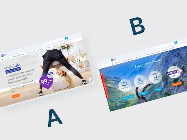
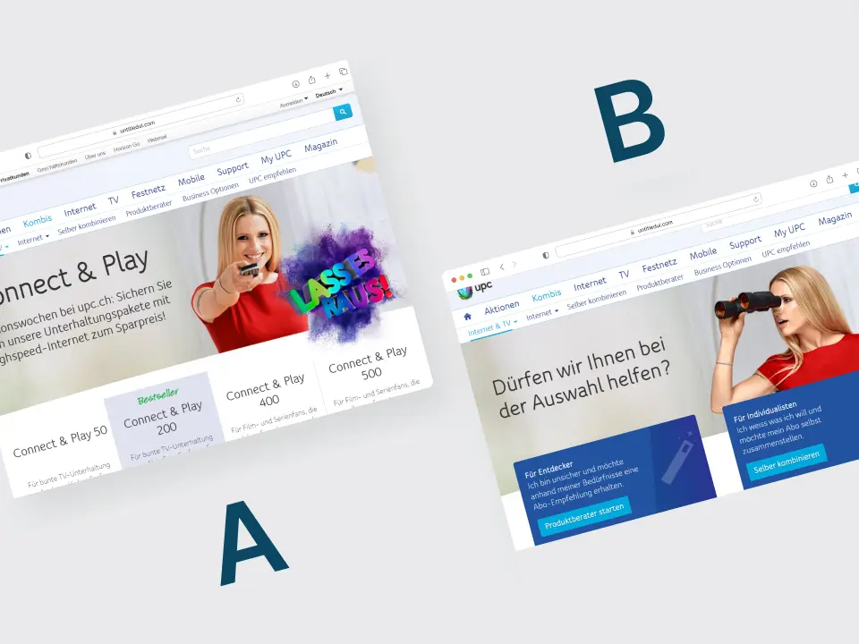
A/B-Test mit lokalisiertem A-Spot und interaktiven Produkt-Bubbles.
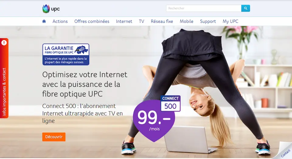
Version A
Standard-A-Spot ohne Personalisierung.
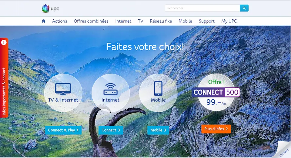
Version B
Regionales Hintergrundbild plus Bubbles zu drei Produktkategorien.
Umsetzung
Konzept, Targeting-Logik, Tracking und Auswertung End-to-End von mir.
Conversion Rate
+20,5 % bei Neukunden
Umsatz
+23,1 %
Durchschnittlicher Warenkorbwert
+2 %
Signifikanz
95 % Confidence Level
Ergebnis der Variante
Die Variante mit regionalem Bild und Produktzugängen erzielte höhere Conversion und höheren Umsatz.
What I take away from it
Einstiege gemeinsam testen
Regionales Bild und Produktzugänge wurden als gemeinsame Variante getestet. Ihr einzelner Beitrag lässt sich daraus nicht ableiten.
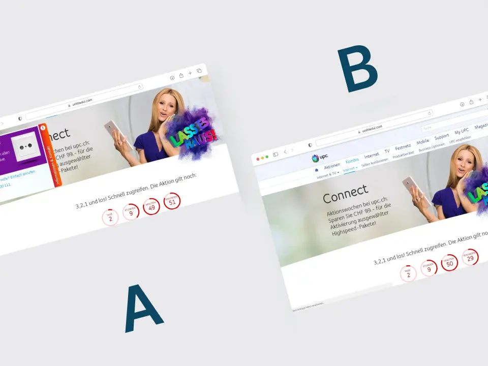
UPC: Telefonberatung im Online-Kaufprozess
Telefonberatung im Online-Kaufprozess getestet.
UPC: Nutzerführung ohne Mobile-Angebot im Test
Die getestete Nutzerführung senkte die Bestellungen um 25 Prozent.
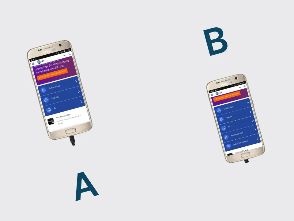
UPC: Zwei mobile Einstiege zur Produktauswahl
+48,1 % Internet+TV Sales und +20,9 % Conversion durch zwei mobile Teaser.