
AXA Kundendokumente: Klare Struktur und wiederverwendbare Vorlagen
Versicherungsdokumente mit klarer Struktur und wiederverwendbaren Vorlagen.
The result in one sentence
Versicherungsdokumente mit klarer Struktur und wiederverwendbaren Vorlagen.
Konzept und Dokumentendesign, Design-System, UX-Optimierung
Customer Journey Designer · Print Designer
Deckungen, Versicherungssummen und Erklärungen waren in den Policen schwer zu überblicken.
Veraltetes Layout
Policen waren schwer lesbar und optisch nicht zeitgemäß.
Keine Hierarchie
Deckungen und Versicherungssummen waren zwischen Fließtext vergraben.
Erklärungsbedarf als Dauerkosten
Kund:innen mussten für Basisfragen zur Beratung greifen.
Rechtliche Präzision und Verständlichkeit mussten im selben Dokument zusammenfinden.
Struktur weiterentwickeln
Bestehende Entwürfe dienten als Ausgangspunkt für die Überarbeitung.
Inhaltliche Komplexität
Jede Vereinfachung musste rechtlich sauber bleiben.
Doppelter Hebel
Ein gutes Dokument entlastet Kund:innen und Beratung gleichzeitig.
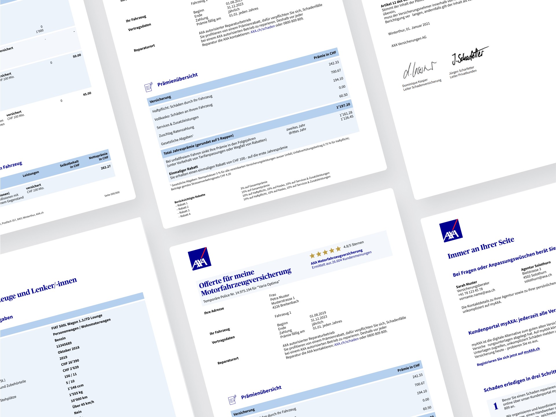
Ich entwickelte klare Dokumentenstrukturen und wiederverwendbare Vorlagen.
Klare visuelle Logik
Symbole und Checkmarks trennen Versichertes von Nichtversichertem auf einen Blick.
Erklärungen im Dokument
Kurze, verständliche Beschreibungen direkt dort, wo die Frage entsteht.
Design-System in Figma
Flexible Vorlagen, die andere Teams eigenständig auf weitere Policen anwenden.
Klare Dokumentenstruktur
Deckungen, Versicherungssummen und Erklärungen visuell geordnet.
Wiederverwendbare Vorlagen
Figma-Komponenten für die Übertragung auf weitere Dokumente.


What I take away from it
Wiederverwendung mitdenken
Die Vorlagen erleichterten anderen Teams die Übertragung auf weitere Policen.
Werkzeug an den Output anpassen
Figma war schnell und kollaborativ, aber nicht die richtige Umgebung für finale Druckdaten. Heute plane ich die Übergabe an ein Print-Tool von Anfang an mit.

AXA Garagenportal: Ein Zielbild für die digitale Zusammenarbeit
Ein Zielbild für das Garagenportal entwickelt.

Status tracking in the MyAXA app
Status und nächste Schritte im Prototypentest validiert. Die Umsetzung wurde verschoben.
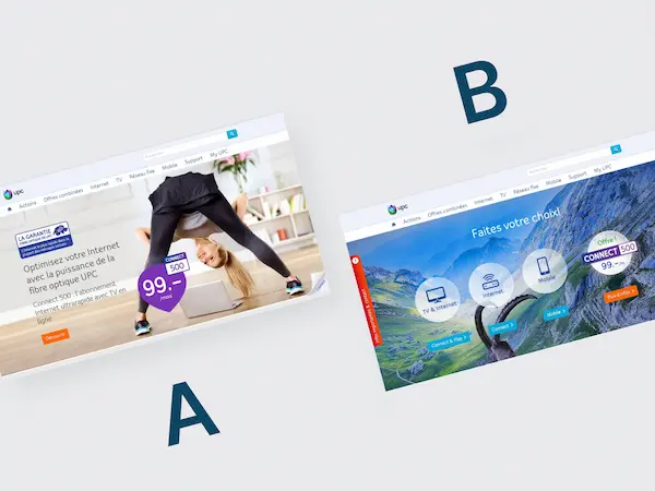
+23,1 % Umsatz: Regionale A-Spot-Personalisierung mit Produkt-Bubbles
+20,5 % Conversion und +23,1 % Umsatz durch regionale Personalisierung . 95 % Signifikanz.