
Swisscom Versicherungen: Verständlich vergleichen
Elf Designrichtungen getestet. Fünf Versicherungsseiten überarbeitet.
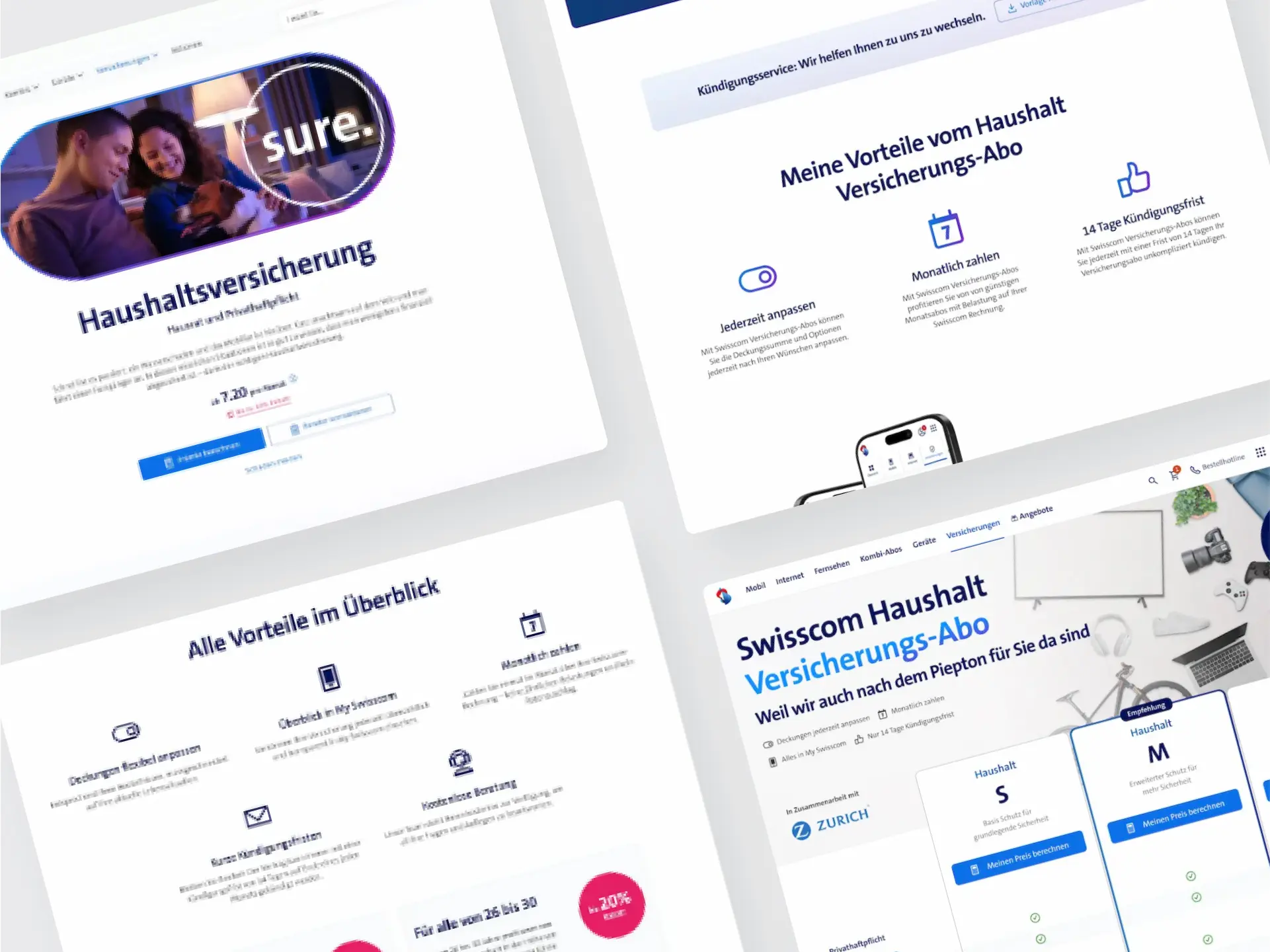
The result in one sentence
Nach dem Redesign lagen die gemessenen Conversion-Raten 16 bis 110 Prozent höher.
UX Researcher, UX Designer, UX Writer, Stakeholder Management, Projektleitung
Mirko Fazio (UX) · Produkt Manager · Business Analyst
Five insurance pages redesigned using research findings.

research participants
design variants developed
product pages with measured uplift
peak conversion uplift
Für die fünf Produktseiten fehlten dokumentierte Nutzertests.
Validierung aufbauen
Verständlichkeit und Vergleichbarkeit sollten mit Kund:innen geprüft werden.
Entscheidungsgrundlage schaffen
Wir wollten wissen, welche Informationen die Produktauswahl unterstützen.
Zu zweit verantworteten wir Research und Redesign für fünf Versicherungsseiten.
Kernteam von zwei
Research, Design, Testing und Auswertung lagen bei Mirko Fazio und mir.
Gemeinsame Grundlage
Wir machten Research und Ergebnisse für alle Beteiligten nachvollziehbar.
Wir verglichen elf Designrichtungen im Präferenztest und überarbeiteten die Seiten anhand des Feedbacks.
Quantitativ und qualitativ
UEQ-Umfrage mit über 1.000 Teilnehmenden, inklusive Wettbewerbsvergleich.
11 Designvarianten im direkten Vergleich
Elf Designrichtungen im Präferenztest verglichen.
Iteratives Redesign
Entwürfe mit Nutzenden getestet und anhand ihres Feedbacks überarbeitet.
Gemeinsam verantwortet
Mirko Fazio und ich verantworteten Setup, Research, Design und Auswertung.
Haushalt
+78 %
Rechtsschutz
+16 %
Reise
+87 %
Mietkaution
+39 %
Freizeit
+110 %
Gemeinsames Vorgehen
Fünf Produktteams übernahmen das Vorgehen als gemeinsame Arbeitsweise.
Before designing, we measured how people understand and compare insurance products.
Quantitative
UEQ survey with over 1,000 participants, including a competitive benchmark as a frame of reference.
Qualitative
Interviews, remote testing and usability tests showed where comprehension actually broke down.
Preference
Max-diff analysis across the design variants to prioritise directions with evidence.
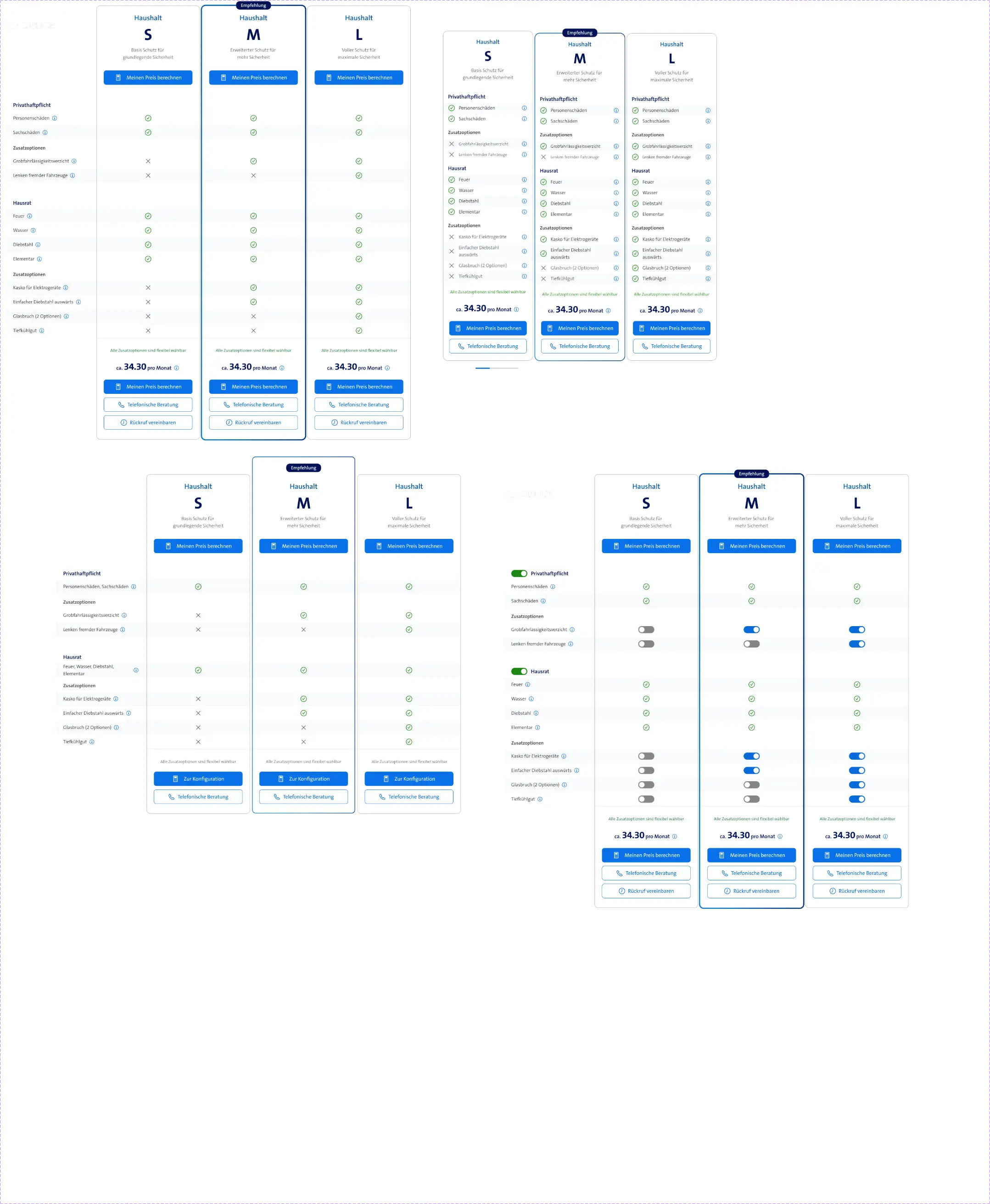
More than one good idea.
Instead of committing to one direction early, we deliberately developed different approaches and let users compare them.
Which variant helps people decide?
We compared eleven design directions in a preference test. Participants selected the most and least convincing variants.
Best: chosen as the preferred variant · Worst: chosen as the weakest variant · n/a: not documented
The preference test produced a different ranking than the team had expected.
Comparability came out on top.
The three strongest variants worked notably with structured selection and direct comparison. The result gave us a clear direction for the further design work.
Compare insurance directly.
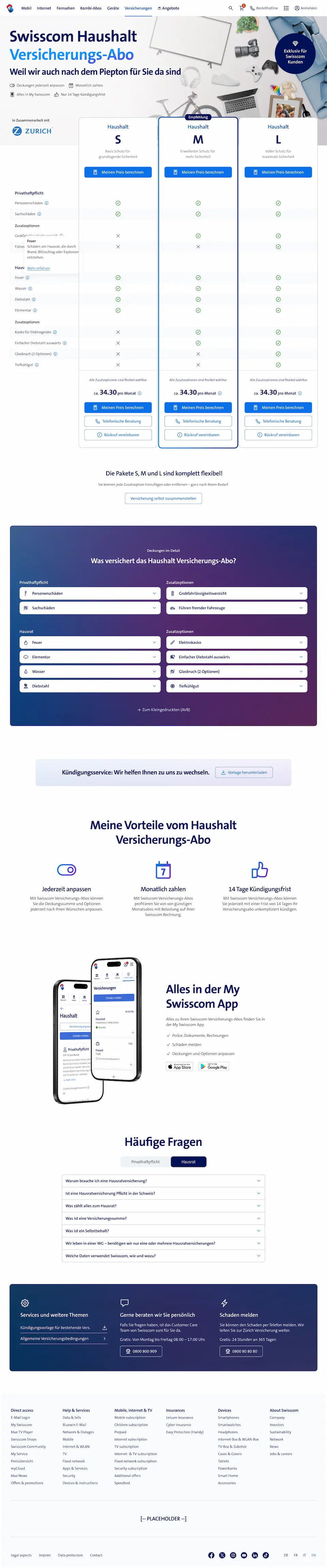
The comparison tables emerged as a direct answer to the research learning.
Differences between insurance benefits become visible faster.
The decision depends less on people reading and remembering long passages of text.
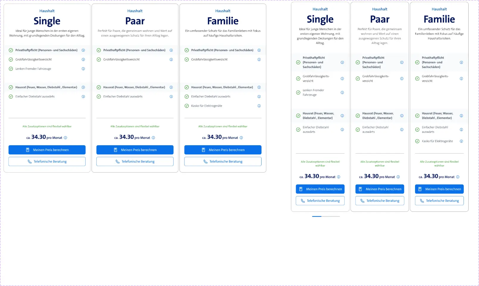
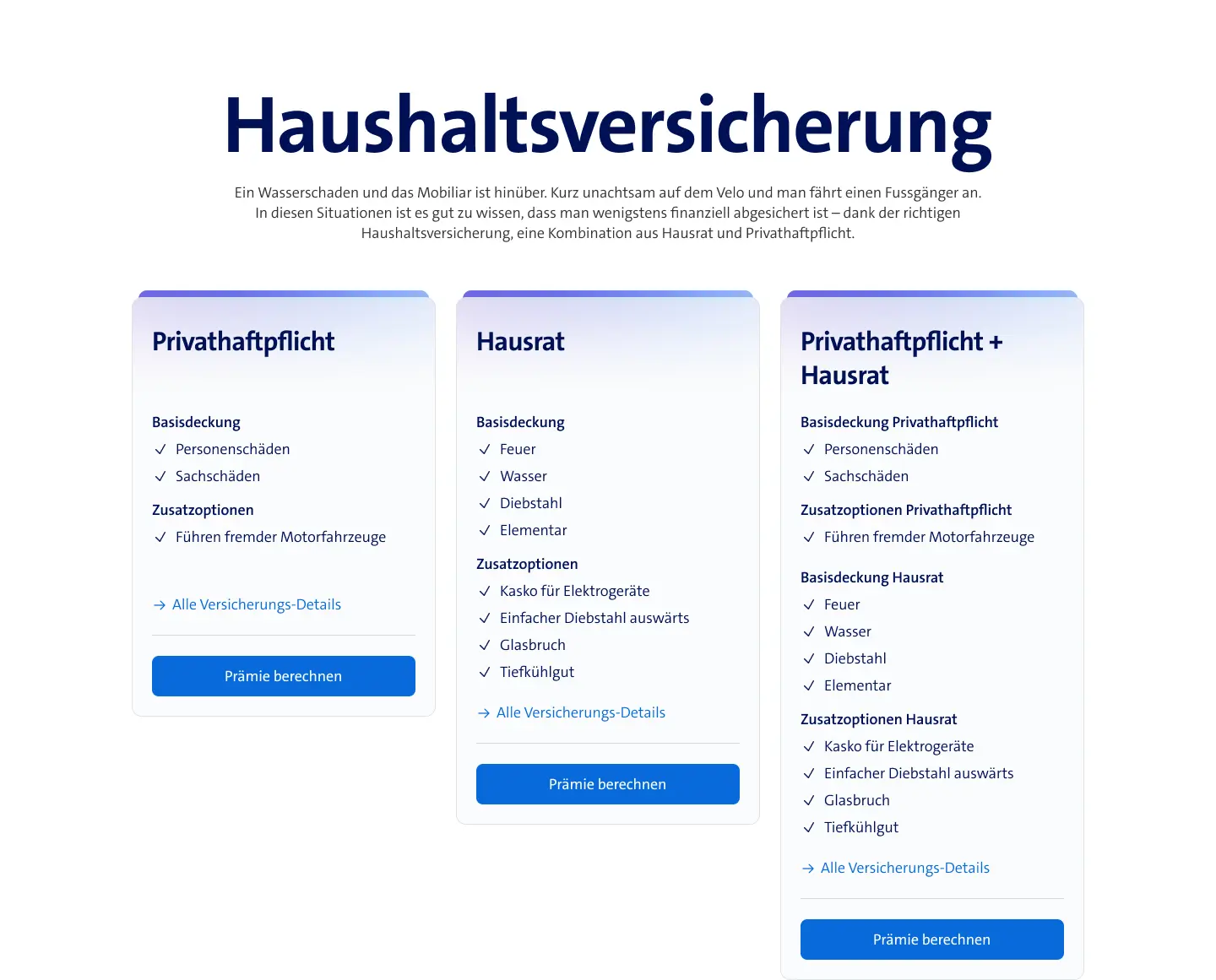
Details exactly when they are needed.
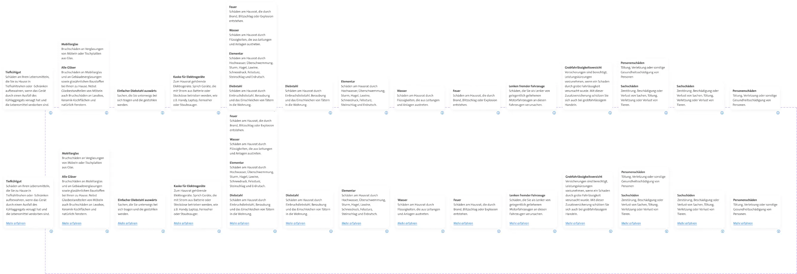
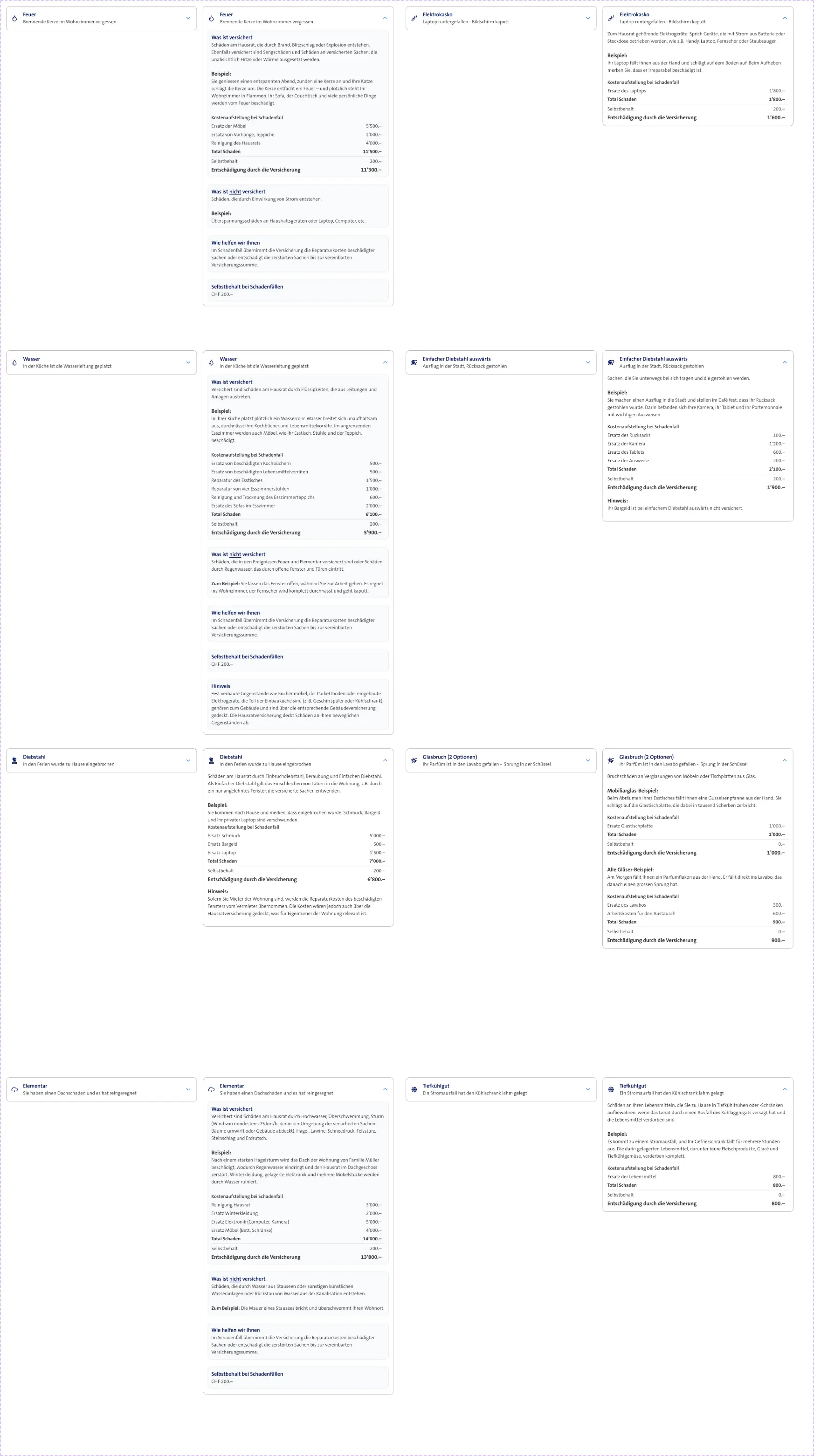
Insurance products require a lot of detailed information.
Instead of showing everything at once, additional information was made available contextually via tooltips and accordions.
The interface stays scannable without removing relevant information.
The decision stays visible.
On long product pages people should not lose sight of their current selection and the next step.
The sticky basket keeps price, selection and the next action present.
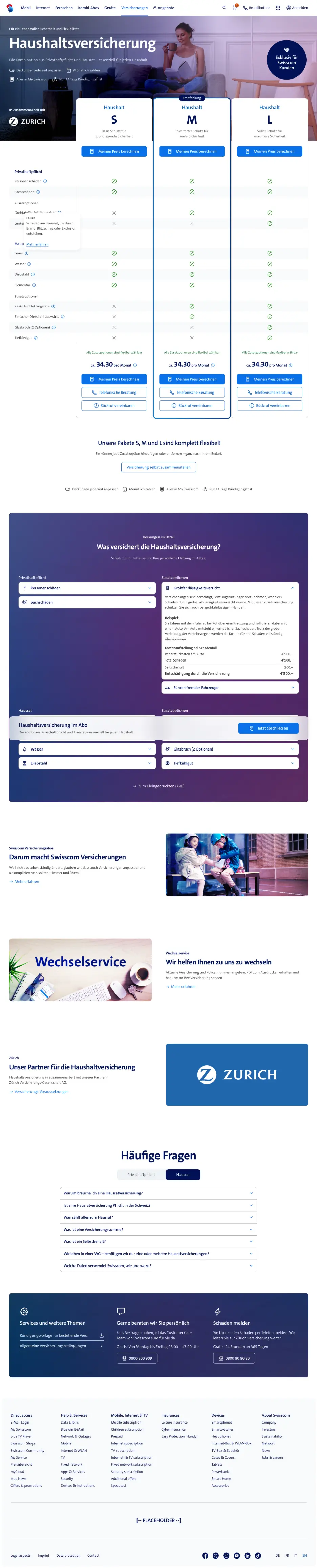
Not simply made smaller.
Comparison, level of detail and selection were re-sequenced for small screens instead of squeezing the desktop layout.



The result.
Five product pages, one logic: compare, understand, decide.

Measured conversion before and after the redesign.
What I take away from it
Präferenzen sichtbar machen
Der Präferenztest brachte eine andere Reihenfolge als intern erwartet.
Vergleichbarkeit verbessern
Die direkte Gegenüberstellung von Leistungen half bei der Produktauswahl.
Wissen nutzbar machen
Die Dokumentation ermöglichte weiteren Produktteams, mit dem Vorgehen zu arbeiten.

Swisscom Insurance: Fünf Produkte in acht Monaten
Fünf Versicherungsprodukte in acht Monaten eingeführt.

GGA Maur: Website-Redesign innerhalb bestehender Markenvorgaben
Wiederverwendbare Templates für Produkt- und Kampagnenseiten.
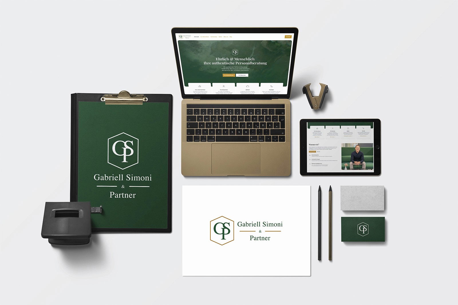
Gabriell Simoni & Partner: Branding und Website in 6 Wochen
Branding und Website in 6 Wochen live. Modular, wartbar, vom Kunden selbst gepflegt.